The idea was to create an alternative logo that would look better in miniature, but would also contain elements symbolising design and technology.
The previous logo had a pen as a symbol of design, which stands on a processor symbolising computing data and modern technology. In the new logo, I decided to use something simpler that would have less detail but also symbolise technology.
And after a few trials, I came to the conclusion that it could be a pen and a power button. Below is the old logo and first draft.

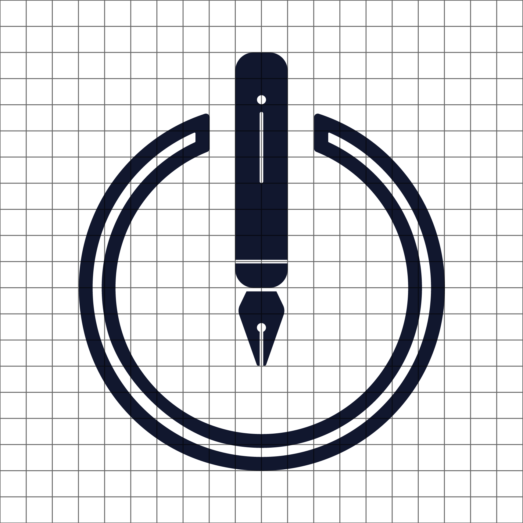
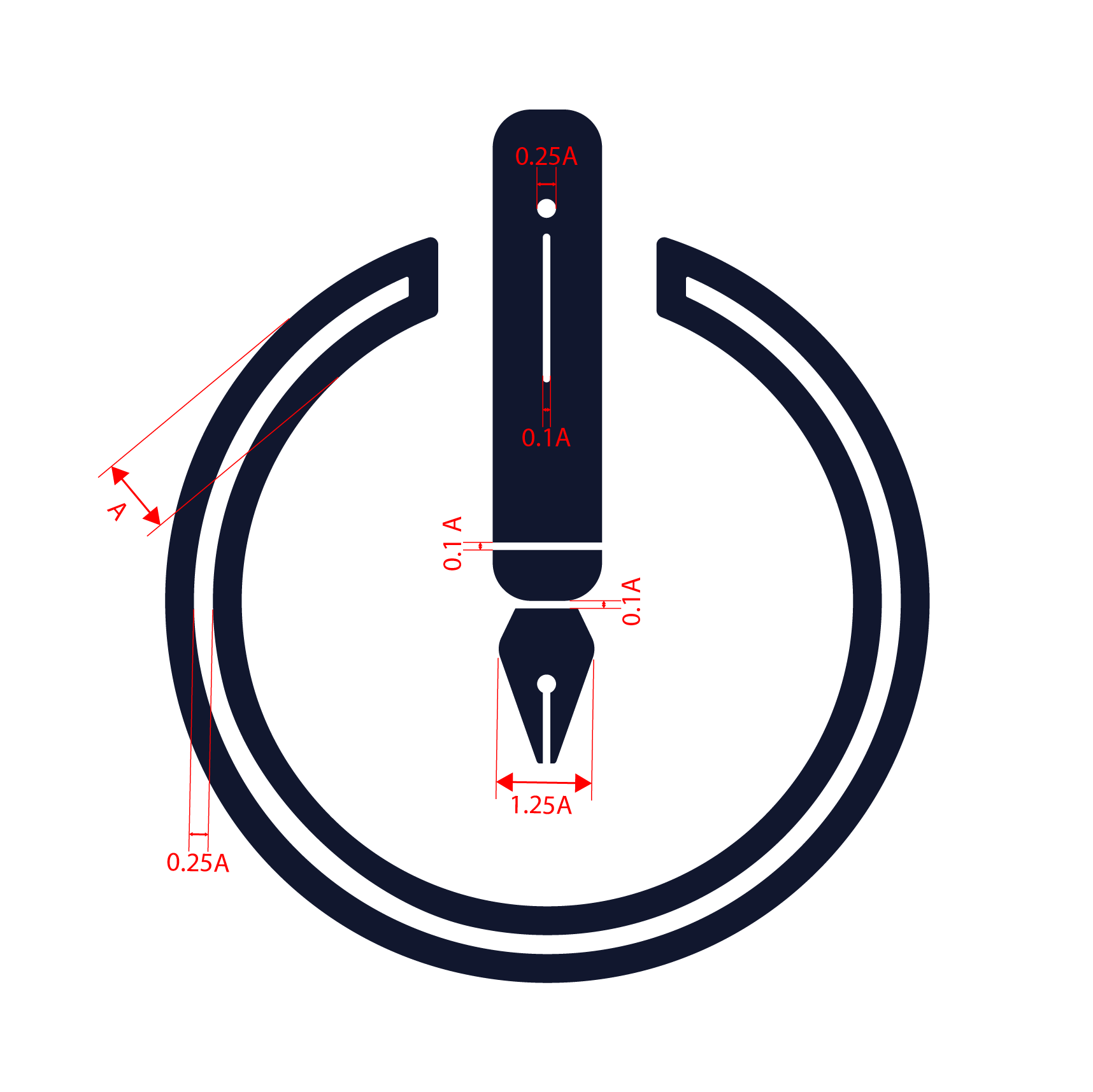
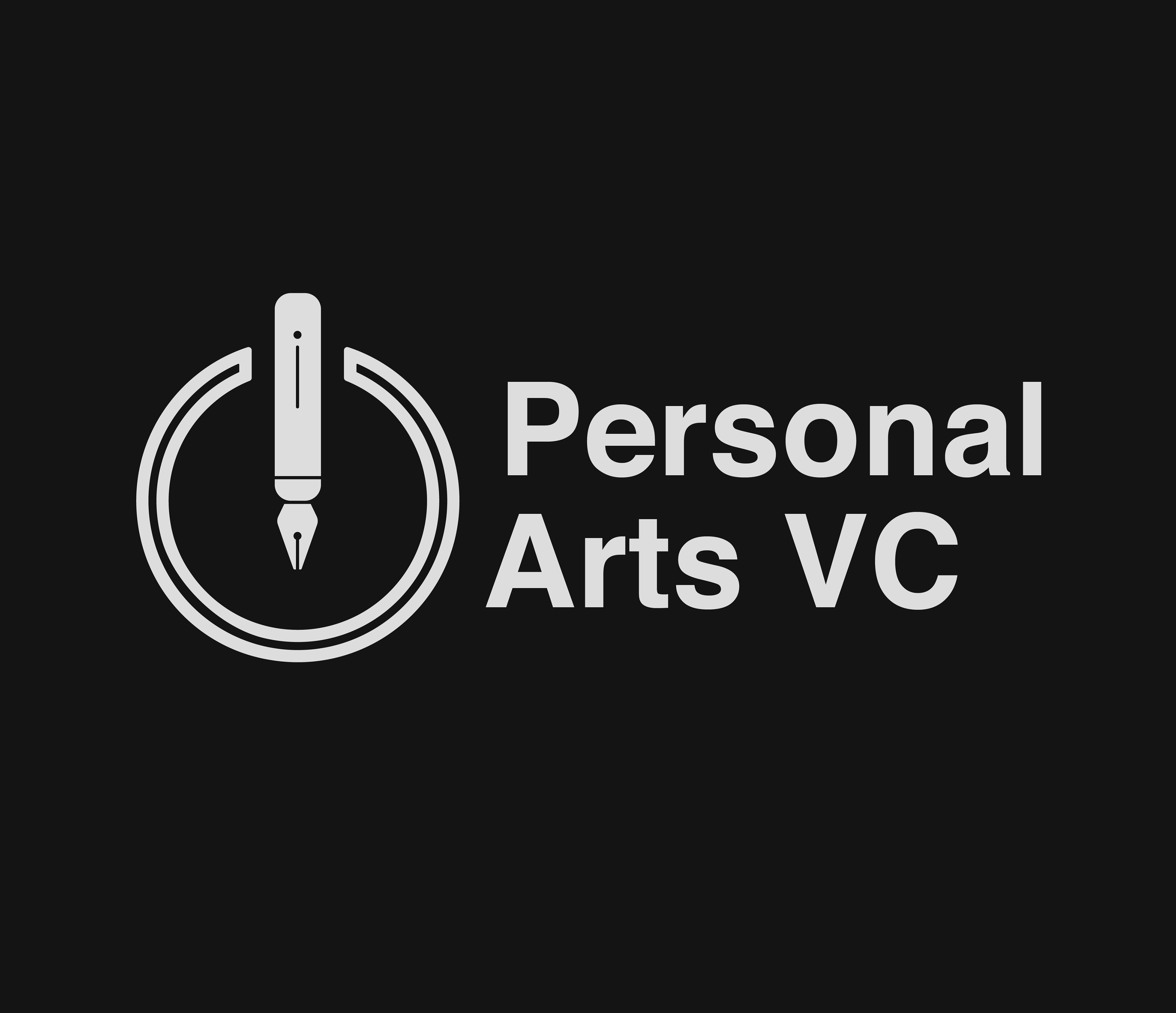
Since the first draft looked rather like a lighter, and faintly resembled a power button, it was decided to reverse the pen, and turn it into a nib, one of the designer's primary tools. Below is the final version
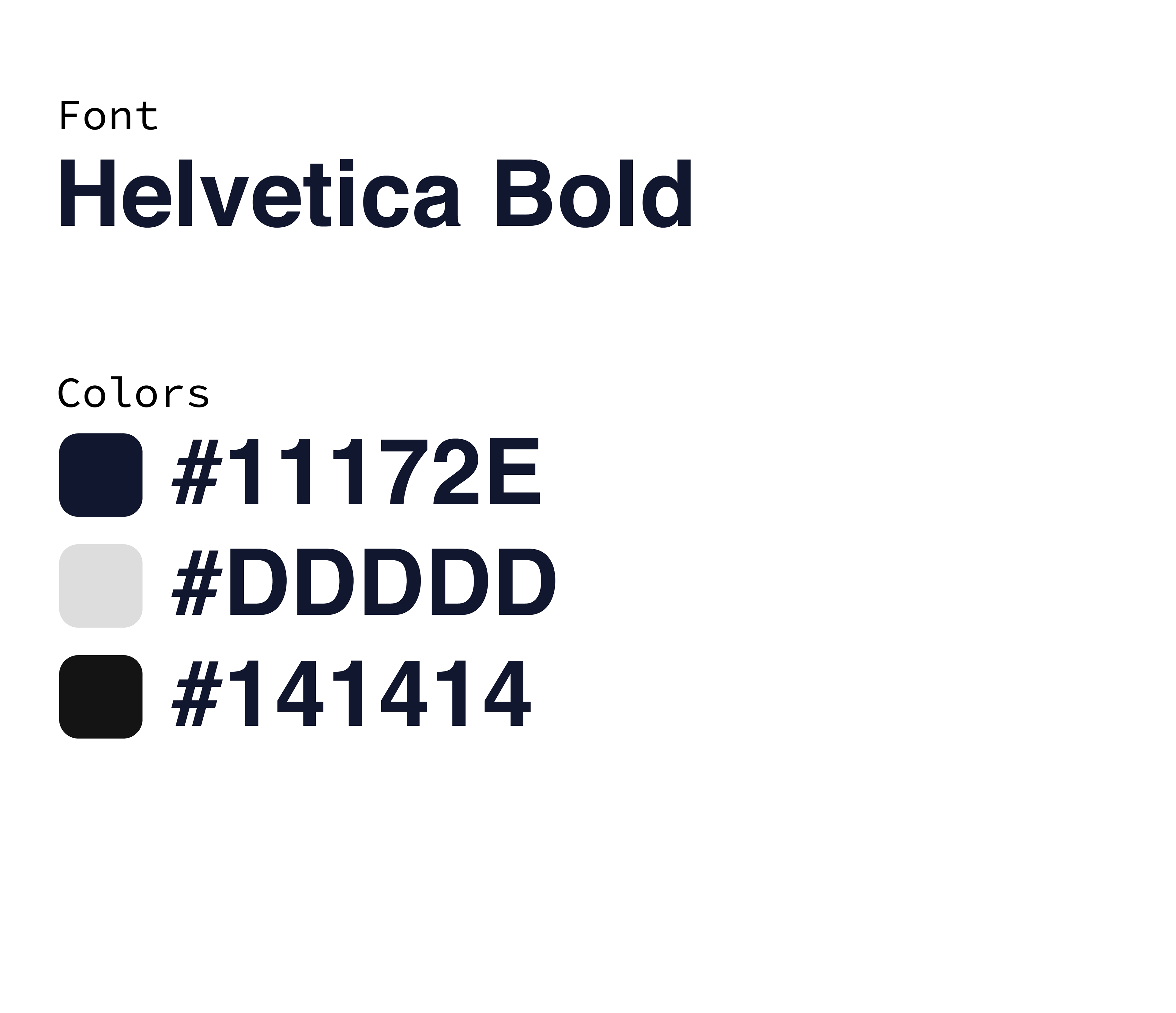
Below are the versions with text. As well as the fonts and colours applied
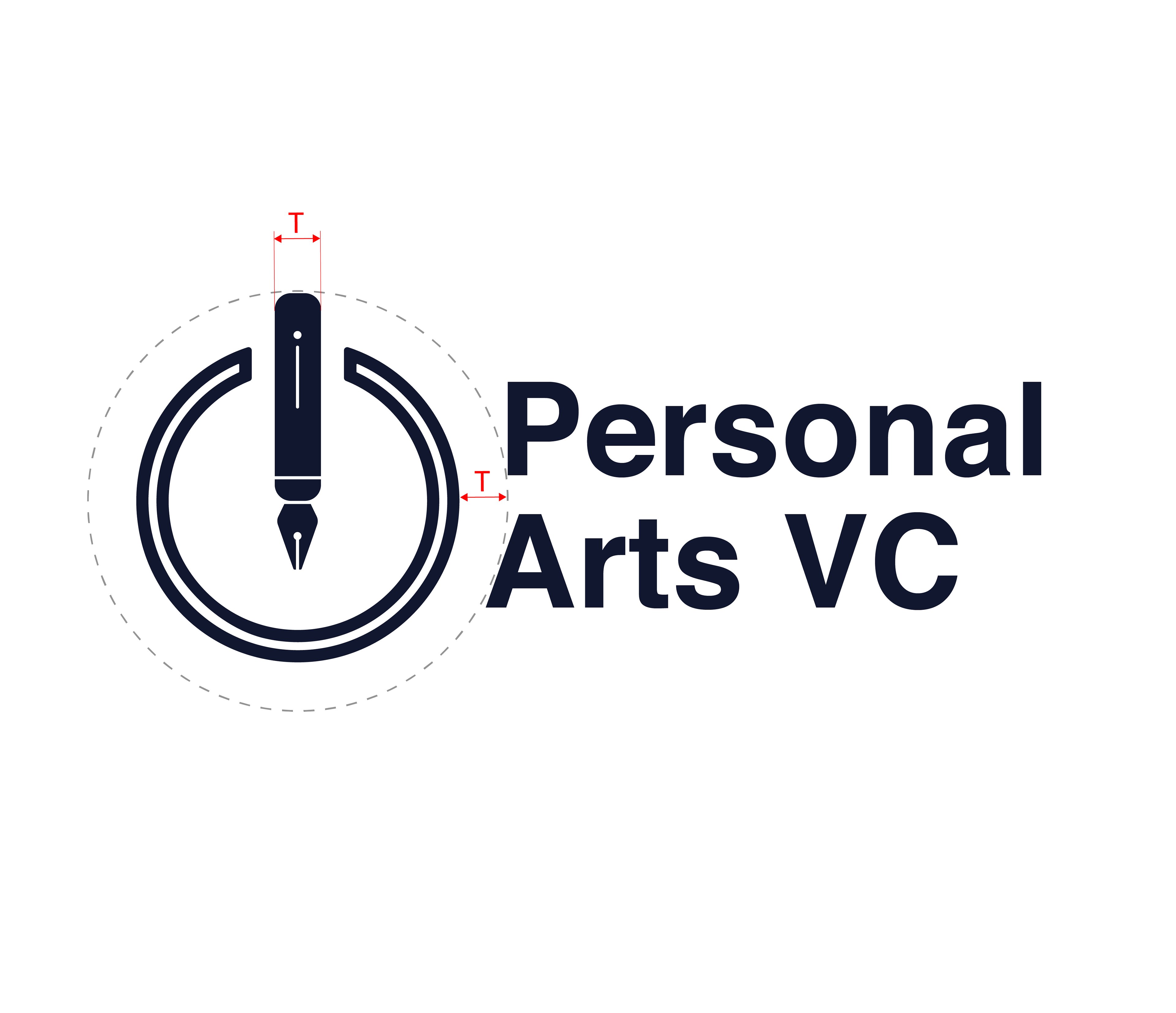
In the end, I've decided to keep the old logo for now as it fits the design of the site better at the moment, however maybe I'll opt for a new logo after the full redesign is done
